
Written by Dave Cook
Art by Craig Paton
Letters by Micah Myers
Flats by Ludwig Olimba
Edited by Sha Nazir and Jack Lothian
Publication Design by Kirsty Hunter
Cover Illustration by Craig Paton
As far as dystopian Sci-Fi worlds go I would put Killtopia up against any book, comic or prose, and I always put my money where my mouth is because I was a Kickstarter backer of both issues. My review of issue one lays out the plot which is mostly centered around a kid named Shinji and the world’s first sentient robot named Crash but as any satisfying issue two would do it continues the foundation laid by issue one and really begins to get into the meat of the story. Issue one was an introduction to the world as well as the characters but issue two is much more of a story centric issue and each of the characters are both on their own plot points. There are several mini plot lines going on at once, and they all feed into the bigger picture of the book, but the main one follows Shinji and his sister Omi. Shinji and Omi have an earnest and heartwarming storyline about the disease Rot that’s ravishing the world, while Stiletto and her brash style has more of a nefarious storyline, but their paths cross as Stiletto ends up taking Crash and trying to use him for her own personal gain. Each of the characters are genuine, even the self centered and heartless like Stiletto, and I believe it’s because Cook has truly thought through his world and what he wants for the characters. I love how Shinji and Omi are the shining light in the sea of selfish societal decay that is the world of Killtopia and I’m even more excited to see what Cook has in store for the rest of this series.
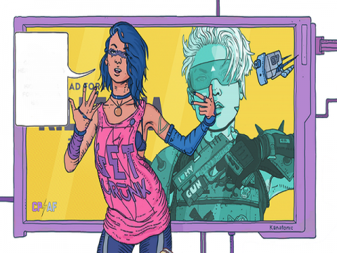
The way that Paton blends the writer influences into a mesh of anime and cyberpunk is truly a pop culture infused masterpiece of art. The flavor of cyberpunk is almost like Bladerunner where the world is dreary and beat down but the color pallete leaves everything bright and futuristic sort of like Ghost in the Shell, I feel like it’s what the Bladerunner world would look like if it stopped raining and the sun came out. What I enjoy most about the art is the fact that the characters are all amazing and Paton puts them in great positions, especially during the fight sequences. Another small but telling piece of Paton’s art style is the slight facial gestures he uses; the smug smiles and sideways grins, and the shocked look on faces goes a long way for the visual aspect of storytelling and Paton nails it. As I said in my first review of issue one, Paton has a style that is somewhat similar to 2000AD, Dredd, and other notable properties, but his style is also very similar to Ramon Villalobos. Villalobos is veteran of both Marvel and Valiant, heading titles like E is for Extinction and Archer and Armstrong and I can certainly see Paton’s style meshing well within both companies, or any major company for that matter. Paton does stuff like the cover of issue two really well, giant mechs and BA poses in front of a seriously detailed background, and that’s not just the cover it’s the interiors as well.
If Killtopia looks like something you would enjoy you can follow their Facebook page or head over to the BHP Comics website and purchase yourself a copy today!

