Story James E. Roche
Art Salomon Farias
Colors Chunlin Zhao
Letters Jamie Me
One of the most fun things for me to see come to fruition is a Kickstarter that I not only wrote a Kickstarter Spotlight for but reviewed a small chunk of the book before it was out. I also backed the project after I wrote the article. I reviewed a thirteen page preview and loved what I saw so really backing the project might have happened anyway but getting a small sneak peak sure didn’t hurt. I actually got a fair amount of swag with a minimal pledge and of course the print was part of the package. I feel like this has been one of the best rewards with the most value out of all the Kickstarter backs I have done lately.

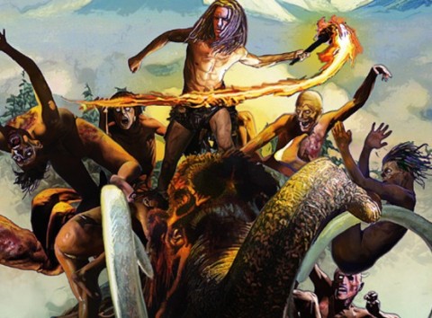
Wretches starts off with a bang and just keeps the momentum going faster and faster until the end where Roche leaves us with a cliffhanger. Roche hits all of the notes I want in a story; he sets up the premise, shows the motivation of the characters, builds the characters relationships with each other which makes me feel more attached to them, and he does all of this while adding some amazing action that showcases the artist’s talents. The story revolves around a brother and sister, Shea and Sean, who have had it rough and lean on each other. Like I said, Roche does a skillful job at world building and establishing these characters. I’m invested and I want to see how things pan out for Shea and Sean, not just because their BA characters, but because I feel them as characters on a human level and sometimes that little nuance is missed with the writing.

Clearly I like the story and the character development but the art of Wretches is just beautiful. Farias has a style that is second to none and certainly in line with what I consider the best comic book art. Zhao colors are complimentary when needed but there are some pages and panels that are really dependent on the colors. I feel like the panels with space in the background are a true testament to Zhao’s style and could really showcase the importance of having a good colorist. Farias has a great style for the pencils but without Zhao I feel like it would be missing something. I love to see teams like this be successful because I feel like it’s a metaphor for life; a writer from the US, a penciler from Chile, a colorist from China, and a letterer from UK.

Speaking of letterer, Jamie Me adds to this artist’s team exactly what it needed, expert level lettering to an already beautifully put together book. Lettering is something that needs to be done right but most of the time letterers don’t get their due respect because it only sticks out when it’s done wrong. I feel like Jamie Me has done all of the right things like picking font but what I really like and what I think stands out the most are the action lettering that accompany certain action panels. The well placed action letters are just a pleasure to see because even though the caption and balloon fonts are done really well I like the way the action letters add to the art and accentuate the art and colors. Jamie Me, Zhao, and Farias seem to feed off of each other’s talents and since they’re literally worlds away from each other and presumably speak different languages I feel like they represent the best in not just indie comics but what comic book creation should be, collaborations that make all involved look better together and give large comic creating companies a run for their money.
Wretches can be found on Drive Thru Comics or on James E. Roche’s website along with some other swag and products from Mr. Roche!